

Hey guys here’s a little tutorial from a learning experience from last month’s project.
Maybe it will help some of yous. Maybe you’ll find things to optimize it further.
My layout requirements are of course an example. You can build it like you wish. The possibilities of grid are endless.
For playing with grid layouts I highly recommend using https://cssgrid-generator.netlify.app/.
- My requirement was a flexible contentgrid with a max-width of 700px centered (you’re also able to use 72ch or the width of your choice). I want it easy and to be flexible if I want to add Componentes / grid columns or change a contentwidth.
- The main contentwidth should be optimized for readability (700px works fine also like values between 62 to 80ch).
- First breakout is for styleboxes around the 700px content
- Second width: sections like podcasts / disturber and more.
- Fullwidth – for some special sections.
- Aside – for additional functions like a toc.
- I wanted a minimum at classes.
The code
Among other things, I learned how to name grid areas, which will be very useful later.
You build the areas like an onion around the main content.
The minmax function defines the minimum width (outside 1em for some whitespace on mobile and 0 for anything else).
The “fr” means “fraction” what is the flexible unit of css grid. A fraction fills the available space without gaps and the numberprefix defines the ratio.
So a code like grid-template-columns: 1fr 1fr 1fr 1fr; results in four equal columns.
If you change the code to grid-template-columns: 1fr 0.5fr 0.5 1fr; it results in two equal wide columns and two equal columns with half of the width of the wide columns.
The grid. A digital frontier… oh oh wrong movie. My bad!
.contentgrid {
   display: grid;
   grid-template-columns:
     [fullwidth-start] minmax(1em, 1fr)
      [wider-start]minmax(0, 0.5fr)
        [wide-start] minmax(0, 0.25fr)
         [main-start] minmax(0, 700px) [main-end]
        minmax(0, 0.25fr) [wide-end]
       minmax(0, 0.5fr) [wider-end]
      minmax(1em, 1fr) [fullwidth-end];
}

/* the * selector moves anything in the center column with 700px */
.contentgrid > * {
     grid-column: main;
}

.content--wide {
     grid-column: wide;
}

.content--wider {
     grid-column: wider;
}

.content--fullwidth {
     grid-column: fullwidth;
}

/* for placing sidebars or elements like a toc */
.content-aside--left {
     grid-column: 1 / 4;
}
You get a full content control with 4 classes (maybe more or less of you need more or less widths or an additional right column).
How to avoid to add every new page the .content class?
I’m a lazy person and I really hate redundant work. So I want to avoid to add every page the main class .contentgrid. We achieve that by adding following code to your functions.php or in the codeeditor of your choice (my personal choice is WPCodebox):
/*
 Add a class to the <main> tag
*/

add_filter( 'bricks/content/attributes', function( $attributes ) {
// Add 'data-is-header' HTML attribute to header with value 'y'
        $attributes['class'] = 'contentgrid';
        return $attributes;
     }
);
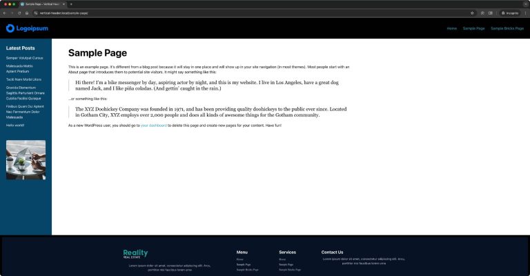
This code adds the class .contentgrid to the normaly not accessible <main> Tag so every new content will automatically be centered and has a maxwidth of 700px.
Codepen
Here is a codepen to play around and experiment with.
https://codepen.io/defcon1702/pen/YzvpLOp
Is this grid useful for you? Do you have any ideas for improvement? Feel free to write it in the comments! 


5 comments
Jürgen
Thanks for this article Sebastian, as a Bricks newbie I'm trying to grab as much info as I can, especially regarding a clever expansion.
Sebastian Berger
Thank you! If you have any questions, always welcome! In my opinion, a big advantage of Bricks is that you can completely customize it to your needs!
Amanda Lucas
Wondering if there is a way to apply the class to blog only posts as its a great layout for easy reading. Blogs would use Gutenberg.
Sebastian Berger
Here the tested code:
add_filter( 'bricks/content/attributes', function( $attributes ) { // Add 'data-is-header' HTML attribute to header with value 'y' if ( is_singular('post') ) { $attributes['class'] = 'contentgrid'; } return $attributes; } );
Sebastian Berger
Hey Amanda,
yes that should be possible if you add a "if statement" with if ( is_singular( 'post' ). I will try to test a whole snippet later. :)